domingo, 29 de junio de 2008

Phytoplankton surprisingly destroys a lot of ozone

Dr Katie Read and fifteen mostly U.K. and U.S. co-authors have studied the mechanisms destroying ozone (O₃) in the lower atmosphere above the ocean:
Extensive halogen-mediated ozone destruction over the tropical Atlantic Ocean (scientific paper in Nature, abstract)
Recall that ozone in the lower atmosphere is a highly potent greenhouse gas. Despite its small amount, it is responsible for almost 2/3 of the effect we attribute to CO₂. (The absolute size of the effect remains uncertain, mostly due to unknown feedbacks, but most of these feedbacks are universal multiplicative factors for all greenhouse gases.) When you divide the "shared absorption" in between the overlapping different gases, the percentages of the total greenhouse effect are as follows (source):

67%+ H₂O (water)
15% CO₂ (carbon dioxide)
10% O₃ (ozone)
3% CH₄ (methane)
3% N₂O (nitrous oxide)
Water itself would be able to cause a much higher percentage of the effect than 67% but some of the spectral lines are absorbed - and attributed to - the competitors. At any rate, you see that O₃ and CH₄, when added together, are almost as important as CO₂, so we should care about them.

Is ozone good? The popular cliché is that the lower-atmosphere ozone is a health hazard while higher-atmosphere ozone is helpful to protect us against ultraviolet radiation

There are all kinds of processes that create and destroy ozone. Dr Katie Read et al., the authors of the present peer-reviewed paper, spectroscopically observed the gases at the Cape Verde Observatory (Atlantic Ocean islands, 500 miles West from Senegal in West Africa).
See also: Other lab problems facing the mainstream theory of the ozone cycle
They found out that phytoplankton apparently creates a lot bromine monoxide and iodine monoxide. These compounds subsequently destroy a lot of ozone and lead to additional products that destroy some methane, too.

The existing conventional mainstream models of Earth's chemistry completely neglect halogens (Fl, Cl, Br, I, At). That's why they end up with a wrong figure expressing how much ozone is destroyed above the ocean - i.e. a wrong figure for the concentration of an important greenhouse gas. The authors decide that the actual amount of ozone destroyed in this way is 50% higher than the models would lead you to believe.

I want to say that the rates of the (halogen-dominated) reactions they are proposing to explain the spectroscopic observations are generally increased by man-made (or other) CO₂ production and by "global warming". Remember that e.g. coccolithophores, a brand of phytoplankton, thrive when the CO₂ levels increase. Also, higher temperatures lead (or would lead) to increased water vapor above the ocean that helps the halogen oxides to escape from the ocean. All these relationships are examples of Le Chatelier's principle i.e. Nature's natural ability to self-regulate. Negative feedbacks always win at the end.

A pseudoscientific reaction from RealClimate.ORG

RealClimate.ORG's Gavin Schmidt clearly doesn't like the fact that the findings show another mildly serious problem with the contemporary climate models. So he spreads some fog. The most breathtaking demonstration of his incompetence (or zeal) is the following quote:
... Yet this is completely misleading since neither climate sensitivity nor CO₂ driven future warming will be at all affected by any revisions in ozone chemistry - mainly for the reason that most climate models don't consider ozone chemistry at all. Precisely zero of the IPCC AR4 model simulations (discussed here for instance) used an interactive ozone module in doing the projections into the future.
Wow! He seems to be so proud that their models neglect virtually everything. So if a mechanism happens to destroy another greenhouse gas that is as important as CO₂, partially as a result of the presence of CO₂ itself, the sensitivity will not be affected "at all"! Who could have thought? Has Mr Schmidt ever heard of feedbacks? Or does he think that there is no interaction (or causal relationship) between the concentration of different chemical compounds (and between temperature, too)? Has he ever heard of the so-called chemical reactions?

What he says is so flagrant denial of basics of science that I believe that most people who have heard some science at the elementary school will know what's wrong with his opinions.

Political activists like him love to talk about positive feedbacks all the time - especially the production of water vapor indirectly caused by CO₂-induced warming - but when it comes to negative feedbacks such as the destruction of other greenhouse gases such as O₃ and CH₄, they shouldn't be looked at "at all"! Is it what you call science and how you want to obtain correct (...) answers, Mr Schmidt? I am stunned.

The climate models that try to emulate the greenhouse effect but that don't reproduce the correct chemistry are simply wrong models because the chemistry that involves the greenhouse gases on either side of the formulae is completely crucial for the greenhouse effect. Because O₃ and CH₄ are also greenhouse gases, it is damn important to know whether they exist in the atmosphere and whether they are being destroyed and whether they will be destroyed in the future (and how much). So Schmidt's statement
Precisely zero of the IPCC AR4 model simulations (discussed here for instance) used an interactive ozone module in doing the projections into the future.
implies that you should now throw precisely all IPCC AR4 models to the trash bin or, to say the same thing more moderately, to work very hard to correct the bug and to introduce the previously neglected important effect that was pointed out by Dr Katie Read et al.

Many similar problems with the models have been found in the past and many more will be found in the future. Science listens - and has to listen - to all these new insights, otherwise it would be no science and it could make no progress. Looking at new data and insights and the elimination (or adjustment) of existing theories is what scientists are really paid for.

Mr Schmidt's own attitude to the error-correcting procedures is clarified by the last sentence of his text:
But it seems that the "climate models will have to be adjusted" meme is just too good not to use - regardless of the context.
Very good. More precisely, what an astonishingly misguided person.

So Mr Schmidt finds error correction in science too good and prefers not to use it and not to correct errors in the climate models. In fact, he even prefers not to talk about adjustments at all because it could indicate that science and models are not the infallible and eternally valid verses from the Holy Scripture that he knows, believes, and uses to evangelize. Instead, they could become temporary insights that could be influenced (or even refuted!?) by every new observation or a new scientific paper - and that would be nothing short of hell! :-)

I happen to use the word "science" for this "hell".

Well, this approach of Mr Schmidt might be one of the reasons why his personal opinions about the climate and the opinions of his comrades at RealClimate.ORG are scientifically worthless piles of crap. The more science will know about Nature, the more crappy the opinions of similar zealots who are not ready to adjust their opinions will be. If you try to quantify how much this particular paper changes the numbers relevant for the climate sensitivity, it is fair to say that 5-10 papers like that are able to change the numbers by something of order 100%. In a year or two, our understanding may be very different if we're doing things right. It's therefore damn important for climate science to (critically) read and (rationally) process such papers!

People like Schmidt are neither willing nor able to correct mistakes in their models and theories. Fortunately for them and unfortunately for the society, they are being paid for something completely different - for a blind promotion of wrong theories and politically convenient conclusions that are irrationally extracted from these wrong, never-updated, obsolete theories.

See also Science Daily, Nude Socialist, and Discover Magazine.

Destruction of greenhouse gases over tropical Atlantic

Large amounts of ozone – around 50% more than predicted by the world's state-of-the-art climate models – are being destroyed in the lower atmosphere over the tropical Atlantic Ocean. Published today (26th June '08) in the scientific journal, Nature, this startling discovery was made by a team of scientists from the UK's National Centre for Atmospheric Science and Universities of York and Leeds. It has particular significance because ozone in the lower atmosphere acts as a greenhouse gas and its destruction also leads to the removal of the third most abundant greenhouse gas; methane.

The findings come after analysing the first year of measurements from the new Cape Verde Atmospheric Observatory, recently set up by British, German and Cape Verdean scientists on the island of São Vicente in the tropical Atlantic. Alerted by these Observatory data, the scientists flew a research aircraft up into the atmosphere to make ozone measurements at different heights and more widely across the tropical Atlantic. The results mirrored those made at the Observatory, indicating major ozone loss in this remote area.

This image is of the Cape Verde Atmospheric Observatory, where instruments for monitoring the atmosphere are stationed. It has been operating for a year and the first year's data...

Click here for more information.

So, what's causing this loss? Instruments developed at the University of Leeds, and stationed at the Observatory, detected the presence of the chemicals bromine and iodine oxide over the ocean for this region. These chemicals, produced by sea spray and emissions from phytoplankton (microscopic plants in the ocean), attack the ozone, breaking it down. As the ozone is destroyed, a chemical is produced that attacks and destroys the greenhouse gas methane. Up until now it has been impossible to monitor the atmosphere of this remote region over time because of its physical inaccessibility. Including this new chemistry in climate models will provide far more accurate estimates of ozone and methane in the atmosphere and improve future climate predictions.

Professor Alastair Lewis, Director of Atmospheric Composition at the National Centre for Atmospheric Science and a lead scientist in this study, said: "At the moment this is a good news story – more ozone and methane being destroyed than we previously thought - but the tropical Atlantic cannot be taken for granted as a permanent 'sink' for ozone. The composition of the atmosphere is in fine balance here- it will only take a small increase in nitrogen oxides from fossil fuel combustion, carried here from Europe, West Africa or North America on the trade winds, to tip the balance from a sink to a source of ozone"

Professor John Plane, University of Leeds said: "This study provides a sharp reminder that to understand how the atmosphere really works, measurement and experiment are irreplaceable. The production of iodine and bromine mid-ocean implies that destruction of ozone over the oceans could be global".

Dr Lucy Carpenter, University of York and UK co-ordinator of the Observatory added: "This observatory is a terrific facility that will enable us to keep an eye on the chemical balance of the atmosphere and feed this information into global climate models to greatly improve predictions for this region in the future".

sábado, 28 de junio de 2008

Friday, June 27, 2008

Hace 20 años, aprovechando un verano muy calurosos en el nordeste de EEUU, sede de la élite política, James Hansen, director ya entonces del Instituto Goddard de Estudios Espaciales (GISS), presentó un alarmista informe al parlamento sobre los peligros del calentamiento global. En el informe venía una gráfica sobre la posible evolución de la temperatura global (en trazos negros), en la que ahora el autor del blog "Climate Skeptic" ha superpuesto la evolución registrada por los satélites (en rojo). Desde los satélites, que tienen una cobertura global, se mide la temperatura con un aparato denominado MSU o AMSU (Advanced Microwave Sounding Units) que mide la temperatura del aire en diferentes niveles. Estas medidas (UAH) se remontan a hace unos 28 años, Diciembre de 1979, y en este período la tendencia calculada para la capa más superficial da tan sólo 0,13ºC por década, en absoluto catastrófica, mucho menor que la pronosticada por Hansen y además con la irregularidad que se manifiesta en la gráfica roja.

Para Hansen era horroroso, y así lo expresaba en su informe, que le temperatura media global ascendiese a los niveles supestamente alcanzados en dos períodos cálidos del pasado: el Altithermal, de hace 6.000 años o el Eemiense, de hace 125.000. Pero este nivel térmico de entonces nada tuvo que ver con el CO2, cuya concentración era bastante menor que la actual. Por otra parte, estos dos períodos, que sí fueron cálidos, fueron también mucho más húmedos que el actual, lo cual no estuvo nada mal.

ps. más sobre el Altithermal y el Eemiense:
Características del Eemiense
Humedad y calor en la primera mitad del Holoceno
y sobre el Libro de Jeremías

jueves, 26 de junio de 2008

Warming on 11 year hiatus? How about cooling?

23
06
2008

A guest post by Basil Copeland

Lucia, at rankexploits.com, has been musing over Tilo Reber’s posting of a graph showing flat 11 year trends in the HadCRUT land-ocean global temperature anomaly and the two MSU satellite data sets, UAH and RSS. In answer to the question whether global warming is on an 11 year hiatus, “not quite,” says Lucia. She challenges Tilo’s omission of the GISS data set, because notwithstanding questions about the reliability of GISS, it still shows a positive trend over the 11 year period in question. Unless all the measures show a flat trend, Lucia’s not ready to conclude that global warming has been on an 11 year hiatus.

I understand the desire to look at as many metrics as possible in trying to divine what is going on with globally averaged temperature. I also understand the reasons for questioning the reliability of GISS. What I don’t understand is why the only measure of trend that seems to count is a trend derived from linear regression. William Briggs recently had an interesting post to his blog on the relationship between trends in CO2 and temperature in which he introduced the use of loess lines to track trends that are not represented well by linear regression. Loess refers to a type of locally weighted regression that in effect fits a piecewise linear or quadratic trend through the data, showing how the trend is changing over time. Especially in an environment where the charge of cherry-picking the data — choosing starting and ending points to produce a particular result - is routinely made, loess lines are a relatively robust alternative to simple trend lines from linear regression.


Click for a larger image

Figure 1 fits a loess line through the data for GISS using the same 11 year period used by Tilo Reber (except that I’ve normalized all anomalies in this discussion relative to their 11 year mean to facilitate comparison to a common baseline). The red line is the GISS anomaly for this period, about its mean, and the blue line is the loess line. While it varies up and down over the period in question, I would argue that the overall trend is essentially flat, or even slightly negative: the value of line at the end of the period is slightly lower than at the beginning of the period. What this loess line shows is that a linear regression trend is not a particularly good way to represent the actual trend in the data. Without actually fitting a linear trend line, we can reasonably guess that it will trend upwards, because of the way the loess line is lower in the first half of the period in question, and higher in the second half. Linear regression will fit a positive, but misleading, slope through the data, implying that at the end of the period the GISS is on an upward trend when in fact the trend peaked around 2006 and has since declined.


Click for a larger image

Figure 2 is rainbow of colors comparing all four of the metrics we tend to follow here on WUWT. Not surprisingly, the loess lines of HadCRUT, UAH and RSS all track closely together, while GISS is the odd duck of the lot. So what does this kaleidoscope of colors tell us about whether global warming is has gone on an 11 year hiatus? I think it tells us rather more than even Tilo was claiming. All of the loess lines show a net decline in the trend over the 11 year period in question. It is relatively minor in the case of GISS, but rather pronounced in the case of the other three. Of the other three, the median anomaly at the beginning of the period, as represented by the loess lines, was 0.125; at the end of the period, the median anomaly had dropped to -0.071, for a total decline of 0.196, or almost 0.2C.

Global warming on hiatus? It looks to me like more evidence of global cooling. Will it continue? Neither linear regression nor loess lines can answer that question. But the loess lines certainly warn us to be cautious in naively extrapolating historical trends derived by simple linear regression.

Not even GISS can support the conclusion from the last 11 years of data that global warming continues to march upward in unrelenting fashion.

Surprise: Explosive volcanic eruption under the Arctic ice found
25
06
2008

I posted on a similar story about volcanic eruptions under Antarctic ice earlier this year. What is unique about this situation is that it was a large eruption that went completely undetected, and under pressures that they thought not possible. The big question is then; where did the heat from the volcano go, and what effect did it have on the sea ice environment? Research has been going on looking at volcanism in the ridge but this discovery of a significant eruption in 1999 is new and unexpected.

From Science and The Sea: “In the last few years, for example, scientists have found that a long ridge beneath the north polar ice cap is dotted with volcanoes, and with vents of superheated water that could be home to many new species.”

More info on the Gakkel Ridge here

Today’s Press release from EurekAlert:

International expedition discovers gigantic volcanic eruption in the Arctic Ocean


A “lonely ” seismometer drifts with the sea ice.

Click here for more information.


An international team of researchers was able to provideevidencef explosive volcanism in the deeps of the ice-covered Arctic Ocean for the first time. Researchers from an expedition to the Gakkel Ridge, led by the American Woods Hole Oceanographic Institution (WHOI), report in the current issue of the journal Nature that they discovered, with a specially developed camera, extensive layers of volcanic ash on the seafloor, which indicates a gigantic volcanic eruption.

“Explosive volcanic eruptions on land are nothing unusual and pose a great threat for whole areas,” explains Dr Vera Schlindwein of the Alfred Wegener Institute for Polar and Marine Research in the Helmholtz Association. She participated in the expedition as a geophysicist and has been, together with her team, examining the earthquake activity of the Arctic Ocean for many years. “The Vesuvius erupted in 79 AD and buried thriving Pompeii under a layer of ash and pumice. Far away in the Arctic Ocean, at 85° N 85° E, a similarly violent volcanic eruption happened almost undetected in 1999 – in this case, however, under a water layer of 4,000 m thickness.” So far, researchers have assumed that explosive volcanism cannot happen in water depths exceeding 3 kilometres because of high ambient pressure. “These are the first pyroclastic deposits we’ve ever found in such deep water, at oppressive pressures that inhibit the formation of steam, and many people thought this was not possible,” says Robert Reves-Sohn, staff member of the WHOI and lead scientist of the expedition carried out on the Swedish icebreaker Oden in 2007.

A major part of Earth’s volcanism happens at the so-called mid-ocean ridges and, therefore, completely undetected on the seafloor. There, the continental plates drift apart; liquid magma intrudes into the gap and constantly forms new seafloor through countless volcanic eruptions. Accompanied by smaller earthquakes, which go unregistered on land, lava flows onto the seafloor. These unspectacular eruptions usually last for only a few days or weeks.


The installation of a seismometer on an ice floe.

Click here for more information.


Volcanic ashes on the sea bed of Gakkel Ridge (Photo: WHOI)


Bathymetric chart of the Gakkel Ridge at 85°E. Photographic bottom surveys were conducted along profiles shown as thin, black lines. The photo showing volcanic ashes on the sea bed were taken at the site, which is marked with a red star and the letter a.


jueves, 19 de junio de 2008

A Window on Water Vapor and Planetary Temperature

Here is some interesting news; according to data from NOAA’s Earth System Laboratory, atmospheric water vapor is on the decline globally.

You’ve probably heard many times how water vapor is actually the most important “greenhouse gas” for keeping our planet warm, with an effectiveness far greater than that of CO2.

It is generally accepted that the rank of important greenhouse gases is:
water vapor and clouds which causes up to 70% of the greenhouse effect on Earth.
carbon dioxide, which causes 9–26%
methane, which causes 4–9%
ozone, which causes 3–7%

Note the range of uncertainties, on water vapor some say the percentage goes up to 90% with reduced numbers on the other three.

It is absolutely true that water vapor is the gas most responsible for the “greenhouse effect” of our atmosphere. Greenhouse gases let short-wave solar radiation through the atmosphere, but impede the escape of long-wave radiation from the Earth’s surface. This process keeps the planet at a livable temperature: Without a suitably balanced mixture of water vapor, CO2, methane, and other gases in the atmosphere, Earth’s average surface temperature would be somewhere between -9 and -34 degrees Fahrenheit, rather than the balmy average 59 degrees it is today.

This graph then from NOAA’s Earth System Research Laboratory, showing specific humidity of the atmosphere up to the 300 millibar pressure level (about 8 miles altitude) is interesting for it’s trend:


[UPDATE: After reading comments from our always sharp readers, and collaborating with three other meteorologists on the graph, I'm of the opinion now that this graph from ESRL, while labeled as "up to 300mb only" is misleading due to that label. The first impression I had would be from the surface to 300mb i.e. the "up" portion of the label, but on the second thought I believed the label was intended to be numerical meaning "zero to 300mb" or from the top of the atmosphere down as opposed from the surface up as we normally think of it. The values looked like anomaly values, but are inthe range of absolutes for that elevation also.

Thanks to some work by commenter Ken Gregory, looking at other ways this and similar graphs can be generated from the site, it has be come clear that this is a level, not a range from a level. The label ESRL placed "up to 300mB was intended to list the availability of all data levels. Thus there is no 200mb data.

This demonstrates the importance of labeling a graph, as without any supplementary description, it can be viewed differently than the authors intend. A better label would be "at 300mb" which would be unambiguous. ESRL should correct this to prevent others from falling into this trap.]

For some background into atmospheric absorption efficiency of the electromagnetic spectrum, this graph is valuable:
Note the CO2 peak at 15 microns is the only significant one, as the 2.7 and 4.3 micron CO2 peaks have little energy to absorb in that portion of the spectrum. But the H2O (water vapor) has many peaks from .8 to 8 microns, two that are fairly broad, and H2O begins absorbing almost continuously from 10 microns on up, making it overwhelmingly the major “greenhouse gas”.

Here is another graph looking at it in a different way:

domingo, 15 de junio de 2008

More Signs Of The Sun Slowing Down


In my post from yesterday, I highlighted a paragraph from a NASA press release which touched on one of the final findings of the soon to be ended Ulysses spacecraft mission to study the sun:

“Ulysses ends its career after revealing that the magnetic field emanating from the sun’s poles is much weaker than previously observed. This could mean the upcoming solar maximum period will be less intense than in recent history. “


A few months ago, I had plotted the Average Geomagnetic Planetary Index (Ap) which is a measure of the solar magnetic field strength but also daily index determined from running averages of eight Ap index values. Call it a common yardstick (or meterstick) for solar magnetic activity.


solar-geomagnetic-Ap Index

Click for a larger image


I had noted that there was a curious step function in 2005, almost as if something had “switched off”.


Today, since it is fathers day, and I get to do whatever I want, I chose to revisit this graph. Later I plan to take my children to launch model rockets, but for now, here are some interesting new things I’ve found.


First, I’ve updated the original Ap graph to June 2008 as you can see below.


Click for a larger image


Source data, NASA Space Weather Prediction Center:

http://www.swpc.noaa.gov/ftpdir/weekly/RecentIndices.txt


As you can see, the Ap Index has continued along at the low level (slightly above zero) that was established during the drop in October 2005. As of June 2008, we now have 32 months of the Ap hovering around a value just slightly above zero, with occasional blips of noise.


Since it is provided in the same dataset, I decided to also plot the smoothed Ap Index. I had noted to myself back in February that the smoothed Ap Index had dropped to minus 1.0. I figured it was just an artifact of the smoothing algorithm, but today that number remains there, and there doesn’t appear to be any change even though we’ve had a bit of noise in March that put the Ap Index back up to 10 for that month.


I also plotted my own 24 month smoothing window plot, shown in magenta.


Click for a larger image


I find it curious that the smoothed value provided by SWPC remains at -1. I figure if it is a software error, they would have noted and fixed it by now, and if they haven’t then perhaps they are standing by the number. Odd. One possibility may be that they are using a 12 month fixed window, instead of a moving window month to month. If so, then why show the -1.0 data vaues? Put nulls — in the dataset.


UPDATE: Astute reader Jorma Kaskiseiväs points out something I missed. The explanation is in the header for the dataset file, a short note: # Missing data: -1″. I was looking in the companion readme file for an explanation. Thanks for pointing this out. Surprising though that SWPC does not use a running average. Easy to do as I’ve shown.


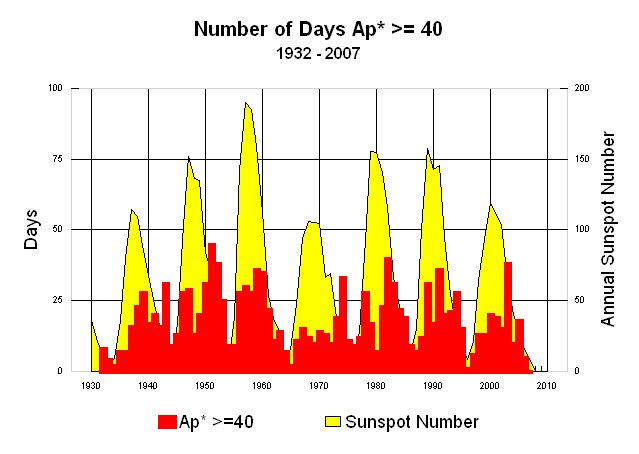
While I was searching for something that could explain this, I came across this plot from NOAA’s NGDC which was used to illustrate solar storm frequency related to sunspots:


Click for original source image, a larger plot is here via FTP link.


But what I found was most interesting was the data file they provided, which had the number of days in a year where the Ap Index exceeded 40. You can view that data file yourself here via FTP link. The accompanying readme file for the data is also available here.


What is most striking is that since 1932, there have not been ANY years prior to 2007 that have zero data. The closest was 1996:


1996 0 0 0 0 0 0 0 0 0 1 0 0 1


———————————————————–

YEAR JAN FEB MAR APR MAY JUN JUL AUG SEP OCT NOV DEC TOTAL


———————————————————–

2005 3 0 2 1 3 2 2 2 3 0 0 0 18


2006 0 0 1 2 0 0 0 1 0 0 0 1 5


2007 0 0 0 0 0 0 0 0 0 0 0 0 0


2008 0 0 0 0 0 0


Now we have almost two years.


Here is my plot of the above dataset:


Click for a larger image


I also decided to plot the 10.7 centimeter band solar radio flux, also a metric of solar activity. It is in the same SWPC dataset file as the Ap Index, in columns 8 and 9. Oddly the smoothed 10.7 CM flux value provided by SWPC also has dropped precipitously and stayed there. I also provided my own 24 month wind smoothed value which is plotted in magenta.


Click for a larger image


Like the smoothed Ap Index, it has also stayed that way a few months. NOTE: The data past Dec 2007 on the blue line from SWPC is not valid. The smoothed 24 month window is.


Either way it appears we continue to slide into a deeper than normal solar minima, one not seen in decades. Given the signs, I think we are about to embark upon a grand experiment, over which we have no control.