miércoles, 11 de junio de 2008

Los últimos diez

Esta es la gráfica de la evolución de la temperatura global en los últimos diez años y unos cuantos meses (Enero 1998-Mayo 2008) que publica el instituto GISS de la NASA bajo la dirección de James Hansen (uno de los grandes jefes de la galaxia).

Para encontrar la figura hay que rebuscar un poco. Se entra en esta página, se pincha en la ventana de gráficos y se va para abajo hasta dar con ella.

Es una doble gráfica. Una se refiere a las temperaturas del aire en los continentes (negra) y otra a la global (roja), tierra y mar, en la que los valores del mar son los de las temperaturas de las aguas superficiales. Las gráficas indican las diferencias (o anomalías) de las temperaturas mensuales con respecto a las medias mensuales del período de referencia 1951-1980 (durante el cual la temperatura media global fue de más o menos 14ºC). Los valores de las anomalías varían entre 0ºC y 1ºC aproximadamente.

Los periódicos, a los que se supone les interesa la actualidad, no la publican nunca. No la encuentran.

posted by Antón Uriarte @ 1:12 AM

lunes, 9 de junio de 2008

Surprise: Earths’ Biosphere is Booming, Satellite Data Suggests CO2 the Cause


Eco Worriers: “CO2 is a pollutant!” Gaia: “Tell that to the biosphere.” Biosphere: “Yumm, burp!”

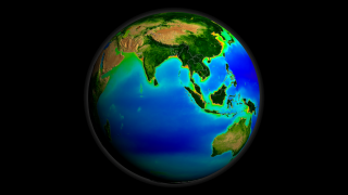
The SeaWiFS instrument aboard the Seastar satellite has been collecting ocean data since 1997. By monitoring the color of reflected light via satellite, scientists can determine how successfully plant life is photosynthesizing. A measurement of photosynthesis is essentially a measurement of successful growth, and growth means successful use of ambient carbon. This animation shows an average of 10 years worth of SeaWiFS data. Dark blue represents warmer areas where there tends to be a lack of nutrients, and greens and reds represent cooler nutrient-rich areas which support life. The nutrient-rich areas include coastal regions where cold water rises from the sea floor bringing nutrients along and areas at the mouths of rivers where the rivers have brought nutrients into the ocean from the land.
In praise of CO2
With less heat and less carbon dioxide, the planet could become less hospitable and less green
Lawrence Solomon
Financial Post, Don Mills, Ontario
Saturday, June 07, 2008

Planet Earth is on a roll! GPP is way up. NPP is way up. To the surprise of those who have been bearish on the planet, the data shows global production has been steadily climbing to record levels, ones not seen since these measurements began.

GPP is Gross Primary Production, a measure of the daily output of the global biosphere –the amount of new plant matter on land. NPP is Net Primary Production, an annual tally of the globe’s production. Biomass is booming. The planet is the greenest it’s been in decades, perhaps in centuries.

Until the 1980s, ecologists had no way to systematically track growth in plant matter in every corner of the Earth — the best they could do was analyze small plots of one-tenth of a hectare or less. The notion of continuously tracking global production to discover the true state of the globe’s biota was not even considered.

Then, in the 1980s, ecologists realized that satellites could track production, and enlisted NASA to collect the data. For the first time, ecologists did not need to rely on rough estimates or anecdotal evidence of the health of the ecology: They could objectively measure the land’s output and soon did — on a daily basis and down to the last kilometer.

The results surprised Steven Running of the University of Montana and Ramakrishna Nemani of NASA, scientists involved in analyzing the NASA satellite data. They found that over a period of almost two decades, the Earth as a whole became more bountiful by a whopping 6.2%. About 25% of the Earth’s vegetated landmass — almost 110 million square kilometres — enjoyed significant increases and only 7% showed significant declines. When the satellite data zooms in, it finds that each square metre of land, on average, now produces almost 500 grams of greenery per year.

Why the increase? Their 2004 study, and other more recent ones, point to the warming of the planet and the presence of CO2, a gas indispensable to plant life. CO2 is nature’s fertilizer, bathing the biota with its life-giving nutrients. Plants take the carbon from CO2 to bulk themselves up — carbon is the building block of life — and release the oxygen, which along with the plants, then sustain animal life. As summarized in a report last month, released along with a petition signed by 32,000 U. S. scientists who vouched for the benefits of CO2: “Higher CO2 enables plants to grow faster and larger and to live in drier climates. Plants provide food for animals, which are thereby also enhanced. The extent and diversity of plant and animal life have both increased substantially during the past half-century.”

From the 2004 abstract: Our results indicate that global changes in climate have eased several critical climatic constraints to plant growth, such that net primary production increased 6% (3.4 petagrams of carbon over 18 years) globally. The largest increase was in tropical ecosystems. Amazon rain forests accounted for 42% of the global increase in net primary production, owing mainly to decreased cloud cover and the resulting increase in solar radiation.

Lush as the planet may now be, it is as nothing compared to earlier times, when levels of CO2 and Earth temperatures were far higher. In the age of the dinosaur, for example, CO2 levels may have been five to 10 times higher than today, spurring a luxuriantly fertile planet whose plant life sated the immense animals of that era. Planet Earth is also much cooler today than during the hothouse era of the dinosaur, and cooler than it was 1,000 years ago during the Medieval Warming Period, when the Vikings colonized a verdant Greenland. Greenland lost its colonies and its farmland during the Little Ice Age that followed, and only recently started to become green again.

This blossoming Earth could now be in jeopardy, for reasons both natural and man-made. According to a growing number of scientists, the period of global warming that we have experienced over the past few centuries as Earth climbed out of the Little Ice Age is about to end. The oceans, which have been releasing their vast store of carbon dioxide as the planet has warmed — CO2 is released from oceans as they warm and dissolves in them when they cool — will start to take the carbon dioxide back. With less heat and less carbon dioxide, the planet could become less hospitable and less green, especially in areas such as Canada’s Boreal forests, which have been major beneficiaries of the increase in GPP and NPP.

Doubling the jeopardy for Earth is man. Unlike the many scientists who welcome CO2 for its benefits, many other scientists and most governments believe carbon dioxide to be a dangerous pollutant that must be removed from the atmosphere at all costs. Governments around the world are now enacting massive programs in an effort to remove as much as 80% of the carbon dioxide emissions from the atmosphere.

If these governments are right, they will have done us all a service. If they are wrong, the service could be all ill, with food production dropping world wide, and the countless ecological niches on which living creatures depend stressed. The second order effects could be dire, too. To bolster food production, humans will likely turn to energy intensive manufactured fertilizers, depleting our store of non-renewable resources. Techniques to remove carbon from the atmosphere also sound alarms. Carbon sequestration, a darling of many who would mitigate climate change, could become a top inducer of earthquakes, according to Christian Klose, a geohazards researcher at Columbia University’s Lamont-Doherty Earth Observatory. Because the carbon sequestration schemes tend to be located near cities, he notes, carbon-sequestration-caused earthquakes could exact an unusually high toll.

Amazingly, although the risks of action are arguably at least as real as the risks of inaction, Canada and other countries are rushing into Earth-altering carbon schemes with nary a doubt. Environmentalists, who ordinarily would demand a full-fledged environmental assessment before a highway or a power plant can be built, are silent on the need to question proponents or examine alternatives.

Earth is on a roll. Governments are too. We will know soon enough if we’re rolled off a cliff.

Radiosondes vs models

Finally, I want to show the status of the "direct" predictions and measurements of the temperature and to mention two graphs from Climate Audit.

This chart, taken from RealClimate.ORG, shows the overall warming expected from the doubling of CO2 concentrations from 280 ppm before the industrial revolution to 560 ppm expected around the year 2100 (assuming business-as-usual, i.e. a pretty constant rate of CO2 emissions in the future), as predicted by the GISS model E, dominated by the greenhouse effect.

Look in the middle of the picture, above the equator. You see the dark red "hot spot" over there. At the height (y-axis) corresponding to the pressure of 200 hPa, you are in the middle of the dark red cloud where the total warming should be not only higher than 3 °C (between 3 °C and 14.6 °C) but much higher than that, probably around 5 °C or so. This figure (5 °C) is roughly 1.5 times the surface warming (around 3 °C according to the IPCC's central figure and around 1.8 °C according to the picture above) - a classical feature of the greenhouse models.

Now, in 50 years, we add about 100 ppm of CO2 and we should therefore induce more than 1/3 of the effect of the CO2 doubling. So in 50 years, the place above the equator where the pressure is 200 hPa should heat up by more than 5 °C / 3 = more than 1.5 °C. (The CO2 emissions in this 50-year period were actually closer to the "earlier" emissions that should have a higher warming impact, because of the logarithmic slowdown: so my figure is probably an underestimate.) Does this significant warming actually occur in reality?
This is the actual graph of this tropospheric temperature record as measured by the Hadley Center's radiosondes (balloons). The net warming during the last 50 years is at most of order 0.2 °C and probably much smaller than that: Steve McIntyre calculated that since the beginning of the "satellite era" in 1979, the balloon trend has been actually negative (cooling). At any rate, it is very close to zero - and it is certainly much smaller than the 1.5 °C of warming predicted by the greenhouse models, as explained in the previous paragraph.

And yes, March 2008, the most recent month they have released, was the HadAT2 200 hPa tropical radiosondes' coolest month at least since the late 1950s (since January 1958) - one that was only matched by 1 month in the early 1970s, namely January 1972 (both Jan 1972 and Mar 2008 had -1.4 °C in the column, check the link in this paragraph).

This place above the equator is the most natural place where the temperature should be measured if your aim is to verify the greenhouse theory of the climate - simply because the signal is predicted to be maximized in this region. And the observations are smaller than the predictions by an order of magnitude or more.

Now, one order of magnitude is not a detail. If you accept that it is fair to compare economics and climatology because their "typical" predictions are comparably inaccurate (and I think that it is fair), the order-of-magnitude discrepancy between the theory and the observations is similar to a prediction by a group of economists who use their "consensus models" to forecast that the GDP will grow (or drop) by 40% a year - because of some effect - but the reality is only 4%. It's a pretty bad prediction, even in the fuzzy context of economics, isn't it?

Now, I want to emphasize that we must be a priori very open-minded because there can exist problems both with the observations as well as with the models. On the other hand, when you look at the weather balloons and the radiosondes they carry (see the picture on the left side), it is not too easy to imagine that there is some serious problem with them. These radiosondes measure the temperature (and the wind speed/direction) by thermometers and transmit the resulting numbers to the terrestrial radio receivers; see the Wikipedia text about radiosondes.

Try to think hard and invent an explanation why such a simple system would be sending warming trends that are 10 times smaller than the "real" ones (predicted by the models). I don't know of such an explanation. But once you find one, you should be ready to solve 1 or 2 similar puzzles - namely why the completely different satellite methodologies also lead to the same negligible warming trend if the "real" trend prescribed by the IPCC should be approximately 10 times faster.

I think it is sensible to expect an explanation what's wrong with the balloon and satellite numbers before someone's presentation of certain numbers from some computer games has a chance to be considered as "reality" by sane people.

Good luck. Before you find your ingenious method to solve these key puzzles, I will continue to think that the IPCC predictions have pretty much been falsified because the order-of-magnitude discrepancy we observe is pretty much the most serious discrepancy that we could a priori expect and if that were not enough for falsification, nothing would be enough. The qualitative agreement in one quantity of minor importance (related to winds) is not enough to confirm your models if more important predictions (temperature) fail.

Now, the balloon data may be very non-uniform and the "local noise" in them can be high. But it is fair to say that if the actual (accurate) thermometers can't demonstrate any significant warming trend over there, the "life on Earth" probably won't die because of such a warming either. A deadly fever is usually strong enough to be visible by thermometers, especially by the most accurate ones created for this purpose. ;-)

So think hard but try to imagine that your assumptions could be incorrect, after all.

Sherwood, Allen, and radiosondes

The media recently wrote far-reaching comments about the latest Nature Geophysics article by Steven Sherwood and Robert Allen (Yale University):
Warming maximum in the tropical upper troposphere deduced from thermal winds.
The authors - or at least the media - have claimed that a new method to "measure" the tropical tropospheric temperatures has removed all contradictions between the theoretical and empirical warming rates in the troposphere.

Recall that the greenhouse-dominated models predict rapid warming in the troposphere, roughly 10 km above the equator. The satellite measurements (UAH MSU, RSS MSU) show an actual warming rate that is at least 10 times slower than the theoretical predictions. The data from balloons and radiosondes they carry, for example the Hadley Center data, confirm the satellite figures. Detailed numbers will be discussed below.

That seems to be a problem. Every acceptable solution to this problem must either find serious errors in both the satellite and balloon data or a serious error in the theoretical models (or both).

Steven Sherwood and his pre-PhD student, Robert Allen, use a different strategy. They pretend that the discrepancy doesn't exist at all. How do they do it? Well, they want you to believe that the measurements of the temperatures don't exist. Instead, they propose their own, idiosyncratic, elaborated "measurement" of the tropospheric temperatures. Well, there is one additional immediate problem: it's not really their own method, as we will see. ;-)


Sherwood & Allen vs Pielke Sr

They look at some patterns in the thermal (?) westerly winds, manipulate them to obtain a rather continuous function, and claim that this function of the winds data is ... a measurement of temperature that is apparently better than the thermometers. Their method is not really original: it is a small subset of the methods discussed by Roger Pielke Sr and two co-authors in 2006 and especially by Pielke Sr and four co-authors in 2001. See also Pielke's comments about his priority.

So the idea is that instead of proving global warming, you prove global blowing :-) and then you argue that blowing and warming sound similar, especially according to your model that links the two. This strategy has the advantage that when the climate begins to cool down, you can also say that global blowing is the same thing as global cooling and the cataclysmic warming can continuously "rotate" into a new kind of catastrophic cooling. :-)

The problems with the particular conclusions by Sherwood and Allen have been discussed by
Roger Pielke Sr,
too. He is preparing a technical manuscript on that issue. The main drawback of their approach is circular reasoning. They want to demonstrate that the models are consistent with reality but what they actually call "reality" is extracted from the models, too.

More precisely, the relationship between the winds and the temperature is derived from the very same models that are shown to disagree with the actual temperature measurements by the balloons and satellites. So the arguments they show only support the compatibility of one particular theoretical prediction with the observations - namely the quantity describing winds as predicted by the very same models.

But a correct model should agree not only with one but with all observed quantities - especially with the temperature if this quantity is the main focus of your models. ;-)

The models also link this quantity related to winds to the temperature but the real measurements actually falsify the predicted temperature trend and the Yale authors don't change anything about that. To a large extent, they only demonstrate a "self-consistency" - which really means uniqueness of one prediction by the models that characterize the winds. It is not shocking that the predictions of such a model are self-consistent; it is much more non-trivial constraint that they should also be consistent with the real data.

domingo, 8 de junio de 2008

La oscilación del Pacifico

Desde hace muchos meses las aguas del Pacífico Norte próximas a la costa meridional de Alaska y a la costa oeste de Canadá y de Estados Unidos presentan una anomalía térmica negativa. Están más frías de lo normal. El mapa de abajo representa en tonos azules las aguas anómalamente frías y en tonos amarillos y anaranjados las aguas anómalamante cálidas. El mapa corresponde al pasado día 5 de Junio 2008 y lo he recortado de este link.
Cuando en esta región del Pacífico existe esa configuración térmica de las aguas, se cree que la temperatura media global desciende o, por lo menos, deja de aumentar.

Hasta hace no mucho, lo que ha preponderado allí, con sus más y sus menos, durante unos 30 años, es una configuración térmica casi opuesta, cuya expresión más típica es la representada en el mapa de abajo (aquí los valores del mapa y de la escala son de la anomalía de altura del mar y no de la temperatura; las aguas cálidas se dilatan y se eleva el nivel del mar y con las aguas frías pasa lo contrario ):

A esta oscilación oceánica, cuyo período es de varias décadas, se le llama PDO (Pacific Decadal Oscillation). Ahora parece que hemos entrado en una fase que tiende a ser negativa. Según algunos, o bastantes, sería una de las razones de que el clima global en lo que llevamos del siglo XXI no se haya calentado y, es posible, que tampoco lo haga en las próximas décadas. En este caso a los niños se les contará en los colegios que fue gracias al protocolo de Kioto.

Abajo pongo la evolución del índice PDO.

sábado, 7 de junio de 2008

NOAA reports on our cooler than normal spring

NOAA: U.S. Has 36th Coolest Spring on Record
June 6, 2008

High resolution (Credit: NOAA)
The March-May spring season was the 36th coolest on record for the contiguous United States, according to an analysis by NOAA’s National Climatic Data Center in Asheville, N.C. Separately, last month ended as the 34th coolest May for the contiguous United States, based on records dating back to 1895.
The average spring temperature of 51.4 degrees F was 0.5 degree F below the 20th century average. The average May temperature of 60.3 degrees F was 0.7 degree F below the 20th century mean, based on preliminary data.
U.S. Temperature Highlights
The March-May temperatures were cooler than average from the Northwest and extending throughout the central Plains and upper Mississippi Valley. In all, 19 states had a cooler-than-average spring.
Twenty-five states were cooler than average for May. Pennsylvania was much cooler than average and ranked eighth coolest.
The unusually cool temperatures kept the nation’s overall temperature-related residential energy demand for May above average. Based on NOAA’s Residential Energy Demand Temperature Index, contiguous U.S. temperature-related energy demand was approximately 3.5 percent above average in May, but near average for the spring season.
Florida, Texas, and Washington were warmer than average for May.

RSS: Global Temperature Also Cooler in May


A few days ago I highlighted the drop in global temperatures as measured by satellite from UAH, the University of Alabama, Huntsville. They published their satellite derived Advanced Microwave Sounder Unit data set of the Lower Troposphere for May 2008 and it showed that it is significantly colder globally, colder even than the significant drop to -0.046°C seen in January 2008.

The global ∆T for UAH from April to May 2008 was -.195°C

RSS (Remote Sensing Systems of Santa Rosa, CA) RSS Microwave Sounder Unit (MSU) lower troposphere global temperature anomaly data by For May 2008 is published and has moved below the zero anomaly line, with a value of -0.083°C for a change (∆T) of -0.163 °C globally from April 2008.

RSS
2008 1 -0.070
2008 2 -0.002
2008 3 0.079
2008 4 0.080
2008 5 -0.083

I had predicted when I posted the UAH data that the RSS value for global temperature anomaly for the lower troposphere would end up around 0.05 to -0.15°C. Coming in at -0.083°C, I was on target.

This value is greater in magnitude than the drop seen in January 2008 to -0.07°C