Old Radar Sites In Greenland Show Icecap Growth Over the Years
(And let’s not forget what we’ve learned about the temperature reporting from the DEW line Radar Stations - Anthony)
By Joseph D’Aleo, CCM, AMS Fellow
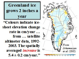
Though the ice may be melting around the edges of the Greenland Icecap in recent years during the warm mode of the AMO much as it did during the last warm phase in the 1930s to 1950s, snow and ice levels continue to rise in most of the interior. Johannessen in 2005 estimated an annual net increase of ice by 2 inches a year.

(Above: Recent Ice-Sheet Growth in the Interior of Greenland, Ola M. Johannessen, Kirill Khvorostovsky, Martin W. Miles, Leonid P. Bobylev, Science Express on 20 October 2005 Science 11 November 2005: Vol. 310. no. 5750, pp. 1013 � 1016, DOI: 10.1126/science.1115356)
A Canadian Icecap emailer noted during the cold war there were two massive radar sites built on the Greenland icecap now abandoned. They are called Dye-2 and Dye-3. When built they sat high above the snow, recent pictures show how the snow is building up around them, proving the snow build-up in recent times. This demonstrates this snow accumulation over time.
Dye-2 and 3 were among 58 Distance Early Warning Line radar stations built by America between 1955-1960 across Alaska, Canada, Greenland and Iceland at a cost of billions of dollars. Their powerful radars monitored the skies constantly in case Russia decided to send bombers towards America. After extensive studies in late 1957, the USAF selected sites for two radar stations on the ice cap in southern Greenland. Dye-2 was to be built approximately 100 miles east of Sondrestrom AB and 90 miles south of the Arctic Circle at an altitude of 7, 600 feet, and Dye-3 was to be located approximately 100 miles east of DYE II and slightly south at an elevation of 8,600 feet.
The selected locations for the new radar sites were found to receive from three to four feet of snow fall each year. Since the winds were constantly blowing with speeds as much as 100 mph, this snow accumulation constantly formed large drifts. To overcome this potential problem, it was decided that the Dye sites should be elevated approximately twenty feet above the surface of the ice cap.
Dye 3 was built in 1960. From a distance the structure, with its onion-shaped dome, looks like a Russian orthodox church. Dye 3 was an ice core site and previously part of the DEW line in Greenland. (The Distant Early Warning (DEW) Line: A Bibliography and Documentary Resource List Arctic Institute of North America, Page 23). As a Distant Early Warning line base, it was disbanded in years 1990/1991. The Dye 3 cores were part of the GISP (Greenland Ice Sheet Project initiated in 1971) and, at 2037 meters, was the deepest of the 20 ice cores recovered from the Greenland ice sheet as part of GISP. Samples from the base of the 2km deep Dye 3 and the 3km deep GRIP cores revealed that high-altitude southern Greenland has been inhabited by a diverse array of conifer trees and insects within the past million years. (Eske Willerslev, et al. (2007) Ancient Biomolecules from Deep Ice Cores Reveal a Forested Southern Greenland Science 317 111-114)
The first image below is from 1972.
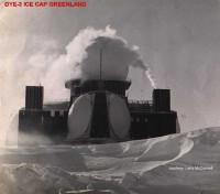
See larger image here.
Here it is in 2006.
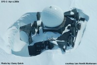
See larger image here.
In looking back at the time the sites were abandoned, one console operator lamented “We were very busy during this time and I was sad to see it end. I remember thinking of all the waste,” he said. The site is slowly disappearing into the snow. Its outbuildings are no longer visible and drifting snow will consume it completely one day, but that day appears to be decades away.” Read more here.


 Il Kennicott Glacier nella foto di Lukas Novak da


